


When I sit down to design something, I always start thinking about the colors I'm going to use first. For some it's font (and don't get me wrong, I love a good font), but I'm all about the perfect colors. They can really make or break a design.
So the question becomes, where do you find the inspiration for the perfect color combination? And then after that, how do you know that the colors you love will really work together?
Let's start with inspiration.
I'll start by browsing around some of my favorite sites and seeing what pops out at me. Here are the first places I go...
1. Design Seed

2. For the Love of Color

3. The Color Collective

These three sites will take a picture or design and tell you which colors are used in it. They're great places to look for inspiration and to see how different colors look together.
4. MulticolorEngine

This search engine is SO cool. You can search for as many different colors as you'd like, and from there it will pull up photos from Flickr that contain those colors. It's great if you're looking for a fun pattern/texture to use in your design. Just make sure the photo you're using is offered under Creative Commons.
5. COLOURlovers

Last, but certainly not least - this is my favorite site of them all. COLOURlovers is a community of designers (and people obsessed with color) that allows you to upload color schemes or search through palettes that others have uploaded. You can also find patterns and textures as well, which are great to add a little depth to your design.
So...now you have some inspiration. How do put everything together so the color combo "looks right"? That's where a lot of the color theory aspect comes in.
I'm by no means an expert, at all. But I do know that color harmony is extremely important when you're building a color scheme. What does this mean? It means you'll want to choose one of these groups.
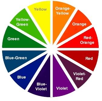 |
| Source: The Color Wheel |
1. Analogous Colors
These are colors that are on the same side of the color wheel. They usually come in sets of three. So, in the example above, you could choose green, yellow-green, and yellow.
2. Complimentary Colors
Colors that are directly across from each other in the color wheel, like red and green, or violet and yellow.
3. Triad
Make a triangle...those are you colors. In this example, we could use violet, green, and orange.
4. Split Complimentary
Like complimentary, except you use the two colors adjacent to the color across from your choice. It's a complicated one. So...in the wheel above, you could choose violet, yellow-green, and orange-yellow. Or blue, orange-yellow, and red-orange.
5. Rectangle
It's like triad, except you make a rectangle! So yellow, orange, blue, and violet would be a rectangle color harmony.
6. Square
Last is square...which is pretty self-explanatory. Each color will be equi-distant from the next color. So in the color wheel above, you'll pick the four colors that are two colors away from each other (ok, so it's kind of complicated...). For this color harmony, you could use violet-red, blue, yellow-green, and orange.
Do you want to learn more? Check out this site.
There is so much to color theory (what about tints, shades, tones, all that stuff?!). But this should get you started. There are also some awesome websites that will help you build a palette according to the color harmony you want to use, such as Color Scheme Designer, Kuler, and Color Wizard.
And now that I've told you everything you'll ever want to know about color...I'm done! Thanks, Amy for letting me participate in Design Week! It's been totally awesome. :-)
No comments:
Post a Comment
I love receiving feedback, so thank you! =)
Your support means the world to me.
Have a charming day ;)
xo, amy