Hey there! I'm Melissa and I blog over at Design Eat Repeat, where I post my latest kitchen success & failures, free printables, design tips, and obsession with peanut butter. (True life.) I'm a soon-to-be college grad (3. More. Months) and when I'm not in class, I run my Graphic Design studio, Melissa Rose Design, where I work mainly with bloggers on rebranding, logo design, and custom blog designs.
Today, I'm going to share with you a behind-the-scenes look into how I created a recent blog designs from start to finish. I'm big into hand drawn illustrations and I love the opportunity to whip out my sketchpad when starting a design. I'm a big believer in sketching out designs in the beginning, in order to fully conceptualize what type of layout is appropriate for that individual blogger.
I recently had the opportunity to work with Danielle over at Framed Frosting on her blog design/rebrand, and today I'm going to give you a little sneak peek at how I created it from sketchpad to computer!
When Danielle first came to me, she had a lot of ideas on what she wanted it to look like. Whimsical, watercolor, polka dots, use of glittery gold, were a few things she had mentioned she liked.
So I set off to find a way to bring all these different elements together into one unified design. Like most of my designs, I began sketching on paper. With design so much geared toward computers these days, it's important for me to take a step back and conceptualize before jumping into a design. Sketching can not only lead to other great ideas, but it can also be the first step to creating organic & natural typography and graphics. Many sheets of paper later, I had a few "winning" sketches that I wanted to work with. I scanned them into the computer, where I vectorized them, and worked with them from there.
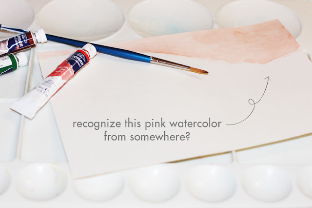
After laying down the "mood" of the design with the hand drawn elements, I then set off to incorporate watercolor into the design. I was unhappy with the watercolor images I was finding online, and knew that the only way to achieve the form, color, and quality I wanted was to produce it myself. So I whipped out my sophomore year watercolor set and began painting. I set off to achieve a shape that would fit well as a header and frame the top of the blog.
After producing the main graphic elements, the next step was to move to the computer. At this point, I sat down and figured out what types of fonts & colors would work well with the whimsical & organic feel I was trying to achieve. A mix of whimsical script & both clean cut serif and sans serif fonts turned out to be a great mix for a fun, young, and organic feel. Danielle had a certain color palette in mind, and after incorporating it throughout the design, everything came together! I loved working with Danielle to make her vision come to life and am so happy with how it turned out!
>> Website: Melissa Rose Graphic Design Studio <<
And that's how it all came to be! Thanks so much to Amy for inviting me to post today! I'd love for you to stop on by and take a look around! I work primarily with bloggers looking to take their blog to the next level & develop a professional web presence. I'd love to chat with you, so feel free to get in touch by clicking on the links above or visiting me at Melissa Rose Design!


No comments:
Post a Comment
I love receiving feedback, so thank you! =)
Your support means the world to me.
Have a charming day ;)
xo, amy